Founded in 1910, Toledo Ticket Technologies is a fifth-generation, family-owned company specializing in secure access and ticketing solutions for the parking, hospitality, and events/sports industries—and beyond. For more than a century, their logo had become a trusted symbol across the country, with only minor refinements over time.
In 2020, the company formally changed its name from Toledo Ticket Company to Toledo Ticket Technologies to reflect a broader, more innovative range of products and solutions. While the name evolved, the brand visuals had not yet caught up—creating a gap between who the company had become and how it was being represented. The team at Toledo Ticket looked to Acorn Marketing to help modernize and systematize the brand while honoring more than 100 years of recognition and trust.
Rather than starting from scratch, Acorn Marketing approached this project as a brand evolution, not a reinvention. Our goal was to preserve the equity of Toledo Ticket’s iconic circular logo while refining it for clarity, consistency, and flexibility across modern applications.
Key strategic priorities included:
- Simplify and modernize the logo while retaining familiar brand elements to respect legacy recognition.
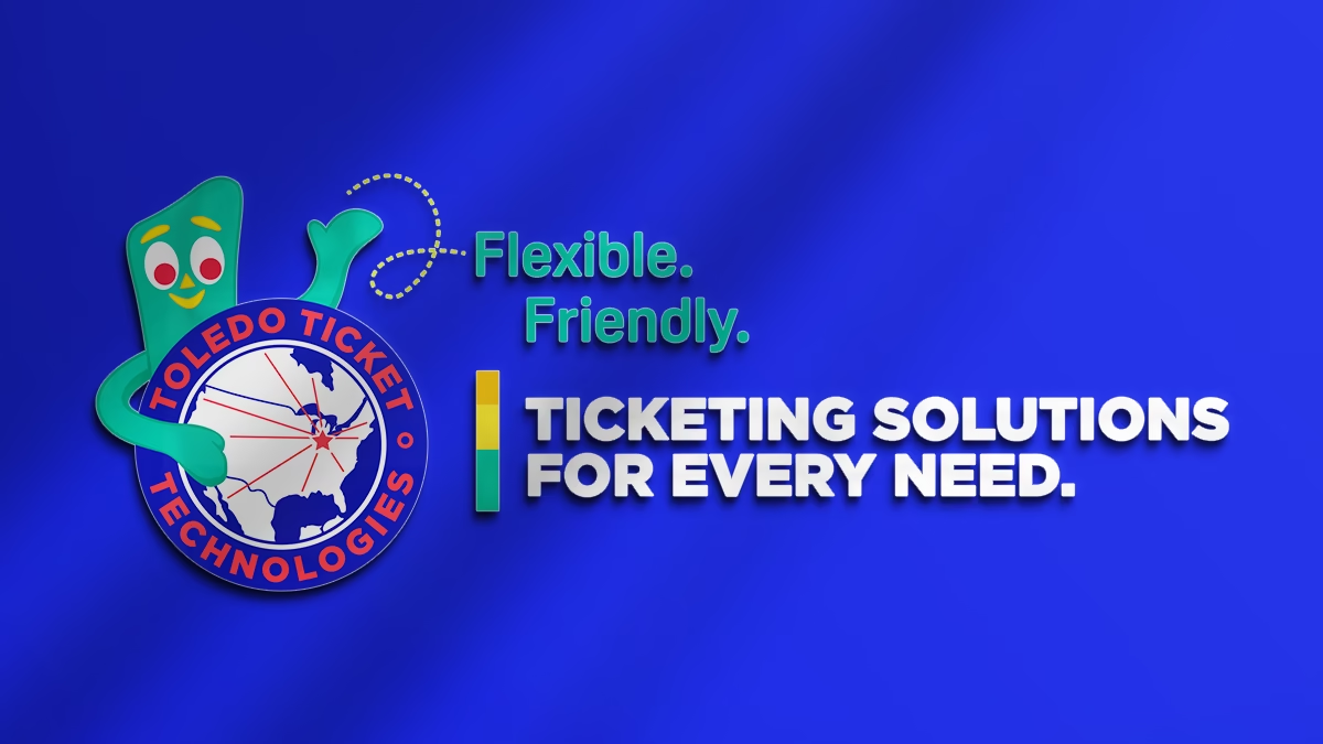
- Reintroduce their longtime mascot, Gumby, in a meaningful, strategic manner.
- Clarify the company’s solutions-focused, customer-first positioning.
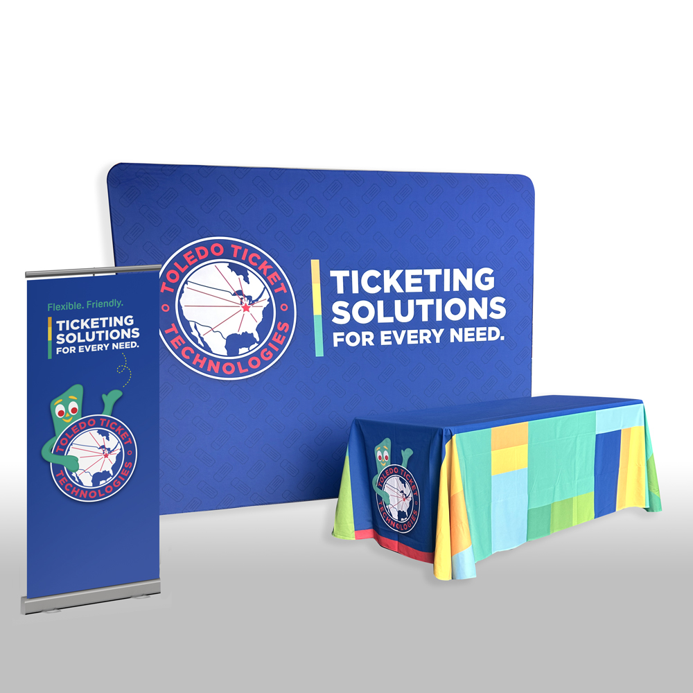
- Create a cohesive visual system that could scale across digital, print, apparel, and product applications.
- Establish clear brand standards to ensure long-term consistency.
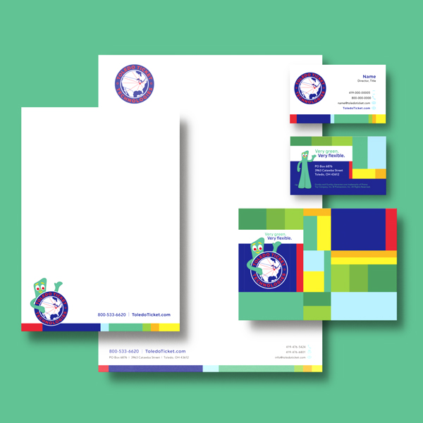
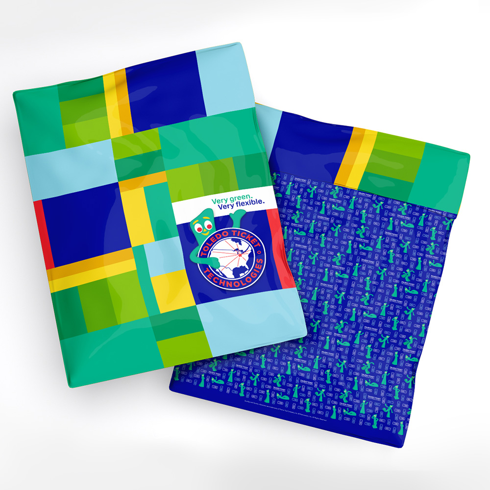
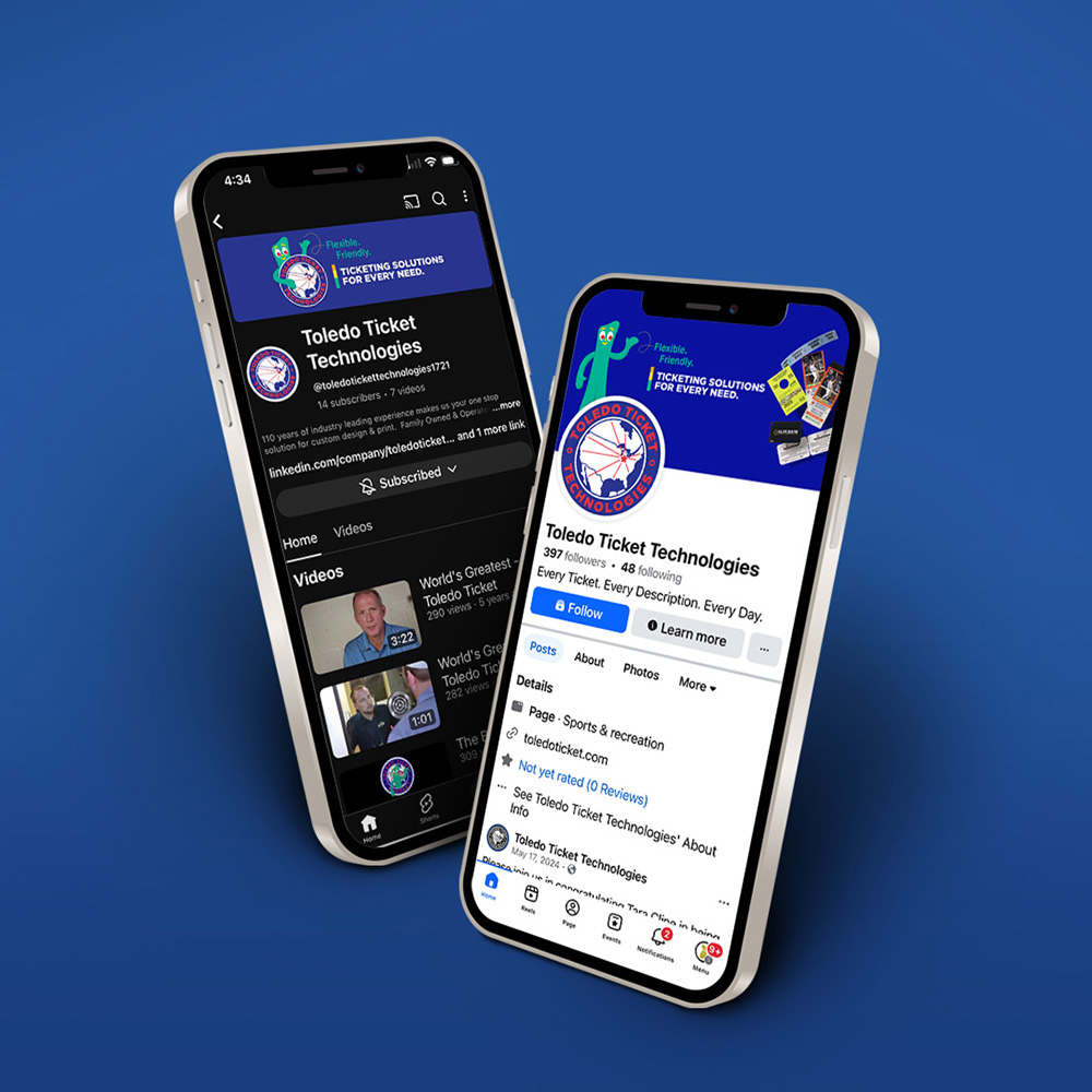
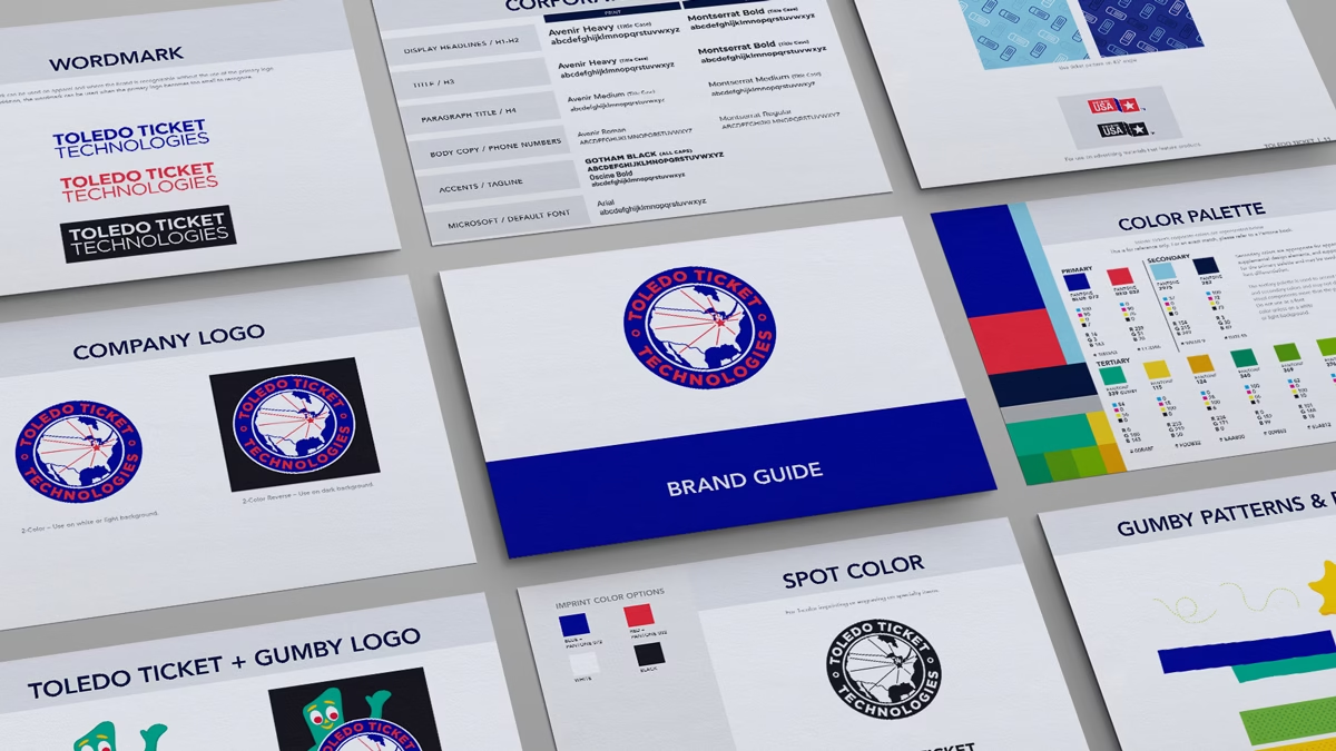
Acorn Marketing refined Toledo Ticket Technologies’ visual identity into a comprehensive, future-ready brand system. The updated logo maintains the recognizable circular badge and national reach motif, while simplifying line work, improving legibility, and refining graphic elements and typography for successful use across all mediums. The refreshed Toledo Ticket Technologies branding successfully bridges heritage and innovation—honoring over a century of history while confidently positioning the company for the future. The new system provides clarity, consistency, and versatility across every touchpoint, from embroidery and signage to digital marketing and product materials.
Expanded Brand Elements
To support real-world use across marketing and operations, we implemented:
-
A modernized wordmark for applications where the primary logo is not practical.
-
A defined primary, secondary, and tertiary color palette rooted in the brand’s iconic red and blue, with complementary accent colors.
-
A flexible typography system optimized for print, web, and internal communications.
-
Custom patterns and supporting graphic elements for use in tradeshow graphics and marketing materials.
- Updated positioning language and playful integration of “Gumby” in a secondary logo.
- Brand strategy and positioning language
- Logo refinement and modernization
- Visual identity system development
- Color palette and typography standards
- Brand guidelines and documentation